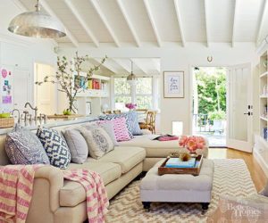
The design rule of 3 is a widely known guideline for interior design. It is fairly simple to implement in your home and helps design elements look their best. The rule of 3 basically means that objects grouped in odd numbers are more visually appealing and more impactful than things grouped in even numbers.

*Accessories: Grouping knick knacks in groups of 3 creates a balanced and finished look.
*Color: Using only two colors for a room can make the space feel bland and two dimensional. Try adding in a third accent color and see how the room transforms into a finished space with depth. The same is true for texture; adding three textures to a room really brings it to life.
*Difficult spaces: If you have a room or corner in your home that is awkward to fill, try adding three things to the area such as a piece of furniture, a shelf, and a piece of artwork.
*Vignettes: Try using three objects of different sizes to fill the tops of tables, shelves, or nightstands.
*Artwork: Hanging artwork in groups of three instead of groups of 2 or hanging pieces in odd numbers instead of even numbers is generally more appealing to the eye.


